
Picture this: You click on a website and… you’re lost. The navigation’s a maze, the layout’s confusing, and you’re already reaching for the ‘back’ button. Sound familiar? As your brand’s digital storefront, your website needs to make an outstanding first impression. The secret? Well it’s not really a secret at all. It’s all in the layout and UX design – two crucial elements that transform casual visitors into loyal customers.
View more:
- The Best Website Builders for Small Businesses
- How to Launch A Website in 2025
- Top Website Design Inspirations Sources
Table of Contents
Website Layout and UX Design: The Differences

Let’s break down two terms you’ll hear a lot in web design: layout and UX design. Think of your website’s layout as the floor plan of a store. Just like you’d strategically place shelves, products displays, and checkout counters in a physical shop, your website layout organises elements like headers, product displays, and contact forms in a way that makes sense.
UX design, on the other hand, is all about the customer’s journey through that store. It’s not just about where things are placed – it’s about how easy it is to browse, find what you need, and ultimately make a purchase. Good UX anticipates your visitors’ needs before they even know they have them.
The Foundation Of Website Layout

Your website layout is more than just a digital blueprint – it’s the backbone of your online presence. Think of it as the invisible architecture that guides how visitors experience your brand. Each section, from headers to content blocks, is strategically arranged to create a purposeful flow. This isn’t just about stacking elements on a page; it’s about crafting an organised structure where every component has its perfect place.
Good layout design is subtle yet powerful – it’s what makes some websites feel effortless to navigate while others leave you frustrated. When done right, your visitors shouldn’t even notice the layout; they should simply find what they’re looking for without thinking twice.
Here’s the thing about layout design – you can’t just throw your content onto the page and hope for the best. Imagine asking someone to sign up for your service before they even know what you’re offering. Awkward, right? That’s why the order of your content matters just as much as the content itself.
Build A Layout and Optimise For UX
Building a website layout involves a strategic process that ensures your content is organised effectively to meet both business goals and user needs. Now let’s look at the practical steps for building your website layout. Here’s a proven process that delivers results:
Scout for Inspiration
Before diving in, take a look at what’s working for others in your industry. Browse platforms like Behance and Pinterest – not to copy, but to spark ideas. Pro tip: Search for ‘web design page blocks’ to find layout patterns that could work for your business.

Get Your Content Ducks in a Row
Start with a simple document that houses all your website content – think of it as gathering all your ingredients before cooking. This includes your copy, images, videos, and any other media you plan to use. Don’t worry about the arrangement just yet; we’ll get to that.
Map Out Your Content Hierarchy
This is where your website starts taking shape. Let’s apply these proven design principles to create a layout that works:
- Grid systems (your design’s foundation for perfect alignment and balance)
- The Rule of Thirds (utilizing negative space and keeping the design simple)
- Strategic use of white space (because sometimes, less really is more)
- Content hierarchy (making sure your most important messages stand out)
- Simplicity (because nobody likes a cluttered website)
Optimising the User Experience
Once your layout’s in place, it’s time to fine-tune the user experience. Here’s your essential UX checklist:
- Usability: Ensure that your website is easy to navigate and that users can accomplish tasks without confusion.
- Visual Appeal: Does your design feel consistent and professional?
- Accessibility: Is your site welcoming to everyone, including users with disabilities?
- Interface: Are your buttons, menus, and forms intuitive to use?
- Interaction: Does everything respond smoothly when clicked or tapped?
- Clear Content: PIs your message crystal clear?
- Conversion Optimisation: Are you making it easy for visitors to take action?
Understanding these principles is one thing – seeing them masterfully applied is another. Let’s dive into a real-world example that brings these concepts to life and shows exactly how strategic design choices can transform a brand’s digital presence.
Case Study: Death Gin by Ven Agency
Bringing It All Together: The Death Gin Success Story
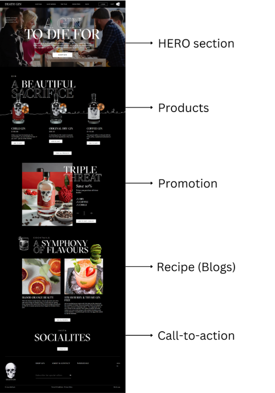
Want to see these principles in action? Let’s walk through how Ven Agency transformed Death Gin’s digital presence into a conversion-driving powerhouse. This isn’t just about making things look pretty – it’s about strategic design choices that guide visitors through a compelling brand journey.
- Step into Death Gin’s Homepage: The moment you land on Death Gin’s homepage, you know you’re somewhere special. The HERO section doesn’t just show you a product – it pulls you into a lifestyle. This isn’t your grandmother’s gin; it’s a bold statement piece for modern spirit enthusiasts. The design team carefully crafted this first impression to answer three crucial questions within seconds: who Death Gin is, what makes them unique, and why their visitors should care.
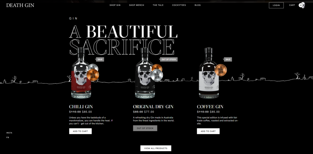
- Product Showcase with Purpose: Rather than overwhelming visitors with options, each Death Gin product gets its moment in the spotlight. Clean, detailed descriptions sit alongside strategic pricing information, with powerful Calls To Action (CTAs) that command attention. These ‘Buy Now’ CTAs are strategically positioned to transform browsing into buying. Every button is designed to catch the eye exactly when visitors are most engaged with the product details – turning curiosity into action.
- Smart Promotional Integration: Just when you’re thinking about making a purchase, the website layout serves up something special. Current promotions appear through elegantly designed sections that feel natural, not pushy. These aren’t your typical flashy sales badges – they’re thoughtfully crafted Call To Action (CTA) buttons that create just the right sense of urgency. The placement is pure UX design strategy: right after you’ve connected with the products but before you’ve made your final decision.
- Beyond the Bottle, Recipe Blogs: Here’s where the user experience truly shines. Instead of ending the journey at the sale, the Death Gin website embraces a broader vision. The blog section transforms the brand from a product into a lifestyle, keeping visitors engaged with valuable recipe content while strategically placing Call To Action (CTA) buttons throughout. It’s a masterclass in blending content with commerce – every mixology post creates another opportunity for visitors to move from inspiration to purchase.
- Final Call to Action: Great website layout and UX design aren’t just about looking good – they’re about creating digital experiences that convert. When you combine strategic layout decisions with user-focused design, you’re not just building a website; you’re crafting a powerful business tool that works around the clock to engage visitors and drive conversions.
Conclusion
Great website layout and UX design aren’t just about looking good – they’re about creating digital experiences that convert. When you combine strategic layout decisions with user-focused design, you’re crafting a powerful business tool that works around the clock to engage visitors and drive conversions.
If you need expert help, explore our website design and development services.
A thoughtfully structured website layout paired with exceptional UX design is crucial for building impactful websites that stand out in today’s digital landscape. At Ven Agency, we don’t just build websites – we create tailored digital experiences that combine expert layout strategy with intuitive UX design, helping your business attract visitors and drive conversions. Ready to take your online presence from functional to exceptional? Let’s transform your website into a conversion powerhouse.
Learn how we delivered results for The Cool Hunter using similar strategies.