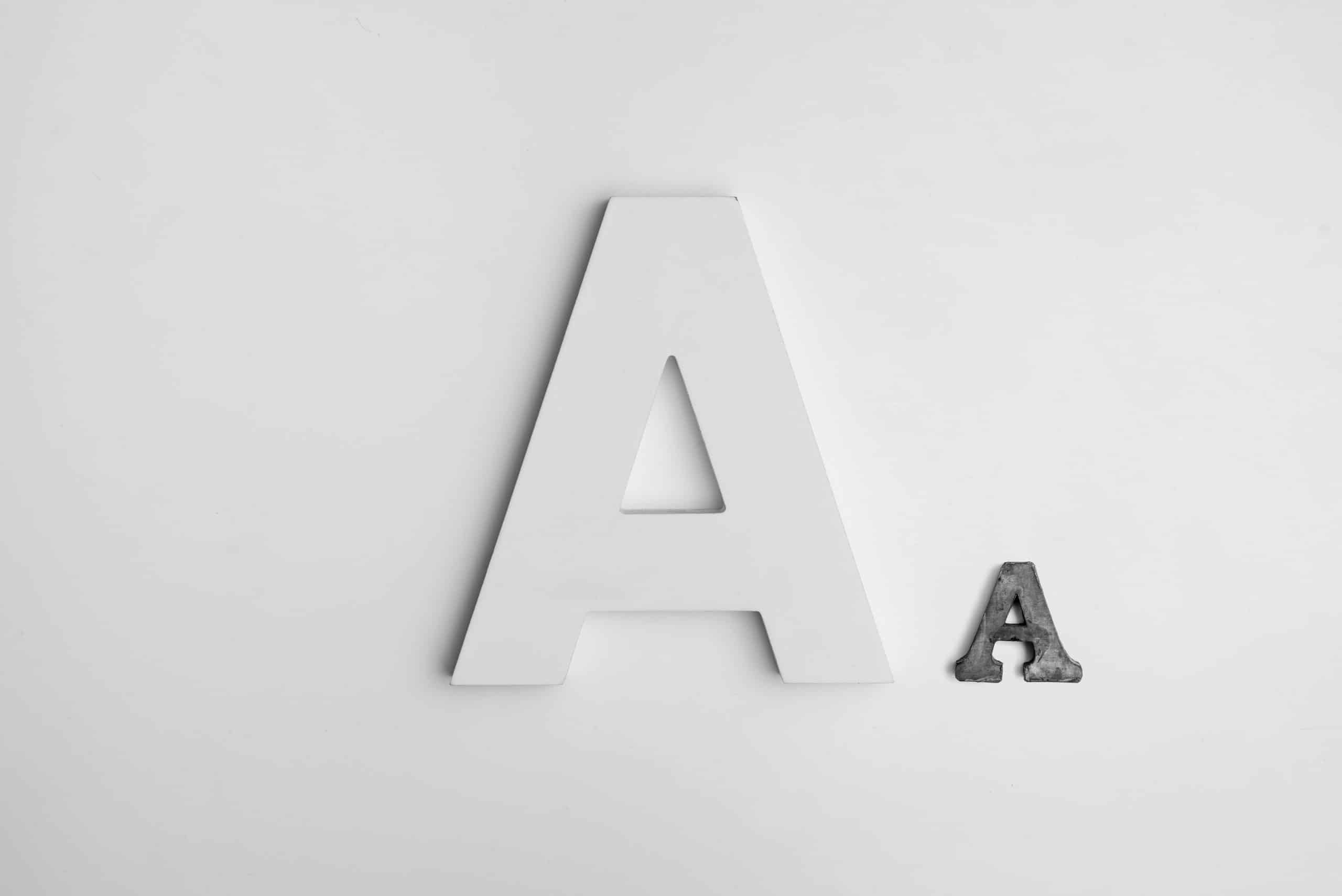
What is typography?
Whenever you read something – like a book, newspaper, magazine, poster, billboard or web page – you will see typography in use.
The term refers to the way in which letters can be arranged to make text appear aesthetically pleasing and easily readable to users.
The art of typography includes all things font, including style, structure, spacing, alignment and overall appearance. Ultimately, it seeks to engage the reader and make for a clear, straightforward reading experience.
Improving your typography
Incorporating effective typography into your website means first understanding your brand’s own distinct voice as well as the message you are trying to convey to your audience.
Successful typography will allow you to clearly label your website, make it easily legible for readers, and differentiate you from your competitors.
Fonts have feelings
Different fonts can display different feelings, and choosing the right one can help to accurately represent your business.
Determining your brand voice will help you in choosing the right font for your website. Is your brand serious? Quirky? Professional? Friendly? Whatever your brand’s unique style, there will be a font to match.
Always relate back to your audience
While it’s important to showcase your brand’s own unique voice, it is also important to keep your audience in mind.
If your brand is fun but your audience is professional, you will need to find a font that aligns with both. Ideally, you should be using fonts that are nestled somewhere between appealing to your audience and demonstrating who you are as a business.
Colour should align with the design
Users don’t want to scroll through a website packed full of clashing colours and overwhelming backgrounds. If you’re adding colour to your fonts, make sure that they work with the design’s existing colour scheme so as not to overwhelm the user.
Limit the number of font styles you use
Just like the old saying goes, when it comes to font styles, less is more. A good rule to follow is using a maximum of 3 different styles – though as with every rule, there are always exceptions. Just remember that keeping things simple is always best.
It’s all about user experience
Creating effective typography will bring you one step closer to ensuring visitors to your site have a positive experience. Being creative with your typography will make your website stand out, but always remember to keep the user experience top of mind.